Date
Mar 15, 2024
Category
UX Research
Reading Time
8 Min
Usability Test on Canvas Mobile
Moderated Usability testing on the learning management system adopted by the University of Washington, Canvas, with a focus on on-the-go usability of the mobile app. Conducted as part of Master's program coursework at the University of Washington.

Duration: 6 weeks (2024.02 - 2024.02)
Role: UX Researcher on a team of 4 researchers
Deliverables: Research Report and recommendations
Context
Canvas is the learning management system (LMS) adopted by the University of Washington to help students access and manage course materials such as syllabi, announcements, and assignments. We wanted to investigate pain points students face when using mobile version to check feedback from professors, to-do items, calanders, and announcements. As fellow students at UW, the product and topic of study as close to our hearts.

Research Methodology
Knowing that both a desktop and mobile version of the LMS exists, we ran an informal poll of our class (who were 3 months into our program and novice users of Canvas) to understand their usage of the two versions.
Based on their answers, we learned that student users use Canvas Mobile to check things on-the-go such as announcements, to-do's, newly graded assignments.
We wanted to test the usability of the mobile app with novice / less confident users, as
UW gets new students regularly
Students don't get a say in the LMS used
Learnability is important
For fast-paced programs like ours, on-the-go usability is important
Research Questions |
How easily and successfully can users find the optimal paths that support their tasks? |
What are the key pain points that are preventing users from effectively using Canvas Mobile on-the-go? |
Does the system's behaviour match the user's expectations? |
Research Set-up
We first did heuristics evaluation to help us understand the app more. Thereafter, we ran a moderated usability test.
Data we collected:
Qualitative and quantitative user behaviour data
Qual: Interviews, Observation, Think Aloud
Quant: Click count, System Usability Scale
Pre-test and post-test questions on attitudes
Participants:
Current undergraduate or graduate student at UW
iPhone user
Either 1) self-rated as 3 or below for confidence in navigating the Canvas Mobile app or 2) used Canvas Mobile for less than 6 months


Our study set-up, where we observed the participant's screen via screen share on Zoom and body language via an over-the-shoulder camera.
Findings
Our research uncovered 7 key findings ranging in severity.
Main sources of error on the Canvas App: |
|---|
Information Architecture that did not match user expectations |
Misleading labels and icon choices |
Poor visual hierarchy |
These sources of error led to poor learnability and discoverability of features on the app.
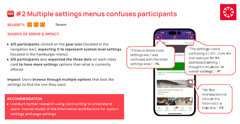
One of the more severe issues we uncovered around information architecture.
Recommendations
We generated a prioritized list of recommendations, which was organized graphically into 3 categories and 2 time frames based on effort and severity. The prioritizations and categorization would help us more effectively collaborate with relevant colleagues and stakeholders in real world environment.